
.png)

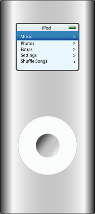
For this exercise I created an image of an iPod. I started by creating a 700 by 700px
document and naming it. Next I created a rectangle shape with rounded corners using Effect -
> Stylize -> Rounded Corners function. Created a 1px black stroke around the shape. After that I created a gradient as shown in the tutorial. In the middle of the shape I drew a circle, then by pressing Object -> Path -> Offset Path created a smaller circle inside it. Again I created a linear gradient, entered the colour coordinates. Left a 1px size stroke for both of the circles. On top of these circles I created a light blue rectangle with rounded corners, again, in the middle of the shape. Inside the rectangle I drew two longer rectangles at the top of the shape, changing the gradient for each shape. I used Myriad Pro lighter font because my Illustrator version did not have the Myriad Pro Bold font. I do not think that the lighter font looks as well as the bold one. I finished the exercise by creating the battery and different menu buttons by creating and combining Basic Shapes. I found this exercise to be quite easy and enjoyable. Although I did skip some of the steps like creating multiple rectangles with the grayscale gradient and using the grid. I did not understand what was the purpose of some of these steps when it is possible to do the same thing easier. As for the grid, I understood that it is used to be more precise, but again, I wanted to go through the steps more quickly so I did not use, even though I probably should have.
Success:
I did not have any problems creating this project. The iPad looks quite similar to the one shown in the tutorial.
Fail:
The gradient on the iPad is slightly different to the one shown in the tutorial. Also, I did not have the font recommended in the tutorial so I tried to find a similar one.